bigger buttons for viewing model slices
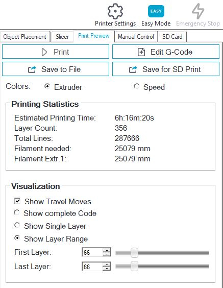
Maybe it is just my old hands, but I find it rather difficult to keep my pointer on the up or down arrows for FIRST LAYER, LAST LAYER when inspecting a sliced model under the PRINT PREVIEW, VISUALIZATION section. Since there is tons of open space on that screen in that section, could you add MUCH larger up/down buttons please.

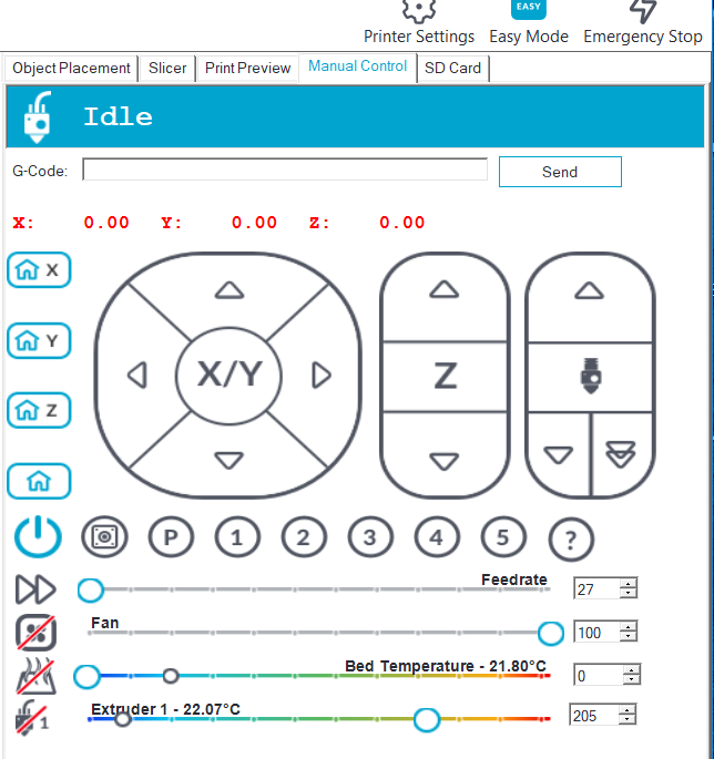
While you are at improving the UI could you also increase the font size on the MANUAL CONTROL section so my old eyes will easily find and read those temps. They appear to be about 8p. 12p would be great and it looks like there is plenty of room for it.

thanks

While you are at improving the UI could you also increase the font size on the MANUAL CONTROL section so my old eyes will easily find and read those temps. They appear to be about 8p. 12p would be great and it looks like there is plenty of room for it.

thanks

Comments
Regarding font size we already have increased it to maximum possible without increasing required height of view. So if we increase it more we get new complaints that not everthing fits on window. But also here you have the alternative to look at the window bottom - there you find the temperatures also in a bigger font.
Alternaively use repetier-server as print daemon (you can configure host to use repetier-server in prnter settings so you can still prepare everything like you are used to) and it's interface for monitoring. There everything is bigger since it is also for touch interface designed.